|
|
Post by yeayeayeah on Feb 9, 2015 5:01:04 GMT -5
I don't think its terrible anymore. I was just wanted Brian Cannon to come back like we thought.
|
|
|
|
Post by Marcos on Feb 9, 2015 19:54:17 GMT -5
The deluxe edition cover art is horrible, the regular version with the vertical lines, not so much imo.
|
|
|
|
Post by Jailbird on Feb 9, 2015 20:44:35 GMT -5
It's not terrible but the same photographer took photos that would work way better.
|
|
|
|
Post by AKA... Frozen Eggroll on Feb 9, 2015 20:49:28 GMT -5
If you think that is a good album cover then I honestly feel bad for you.
|
|
|
|
Post by Marcos on Feb 10, 2015 0:04:50 GMT -5
If you think that is a good album cover then I honestly feel bad for you. Taste is subjective, as you may know. You, for some reason, find that word plays game very funny and amusing, don't you? See, everything is subjective  |
|
|
|
Post by Manualex on Feb 10, 2015 0:29:25 GMT -5
If you think that is a good album cover then I honestly feel bad for you. Taste is subjective, as you may know. You, for some reason, find that word plays game very funny and amusing, don't you? See, everything is subjective  The nature of reality is pure subjetive fantasy...  |
|
|
|
Post by Mean Mrs. Mustard on Feb 16, 2015 12:39:20 GMT -5
At least that would have been a bit relevant   It's got a bit of an Abbey Road feel to it. Does anyone else thinks this just goes with the music oh so brilliantly?  |
|
|
|
Post by Norbert Gallhager on Feb 16, 2015 12:43:03 GMT -5
You guys are hilarious!
|
|
Deleted
Deleted Member
Posts: 0
|
Post by Deleted on Feb 16, 2015 12:43:38 GMT -5
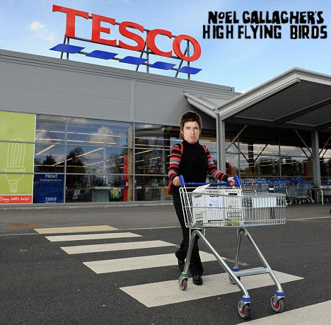
 It's got a bit of an Abbey Road feel to it. Does anyone else thinks this just goes with the music oh so brilliantly?  Noel and Sara coming out of Tesco Sara: "Noel, we forgot the tinned peaches" Noel: "It's alriiiight, you know we can't go back!" Sara: "Not this shit again! I'm going back in." Noel shouting to the Tesco staff: "Lock all the doors!" |
|
|
|
Post by spud on Feb 16, 2015 12:45:21 GMT -5
I don't think its terrible anymore. I was just wanted Brian Cannon to come back like we thought. Erm, look at recent examples of his work here and tell me if you still feel the same: glassheadsmusic.tumblr.com/ |
|
|
|
Post by The Invisible Sun on Feb 16, 2015 13:51:29 GMT -5
I can't be the only one who actually likes the cover art(s). I really like the CY cover art! I'm fine with the brick wall. I'm fine with the lines. What isn't okay is Noel. He looks off. Awkward pose. Awkward expression. Odd clothes. Looks uncomfortable. And is far too large. Should have taken the SOTSOG approach and been shrunk, although not that small, but you get the idea. That being said, the plain brick wall is well...plain. Something else could have been done, give it some color, texture...something. |
|
|
|
Post by Manualex on Feb 16, 2015 14:00:51 GMT -5
Should have taken the SOTSOG approach and been shrunk, although not that small, but you get the idea. What's the SOTSOG approach?  Drum loops, fake choirs, random water sample, backwards guitar solos and little james. |
|
|
|
Post by Manualex on Feb 16, 2015 14:06:21 GMT -5
Drum loops, fake choirs, random water sample, backwards guitar solos and little james. Would kill Dave Sardy twice for all this to be on the cover of the next NGHFB record. haha I just saw the title of the tread, a photo of NY isnt that interesting tbf. |
|
|
|
Post by captaincrankshaft on Feb 16, 2015 14:39:17 GMT -5
I think the cover is shocking but the funny thing is I heard an interview where noel said its a fake wall. So they didnt even just take a quick snap of him outside some dodgy toilet, they had that wall made for the shoot.
|
|
|
|
Post by The Invisible Sun on Feb 16, 2015 14:43:32 GMT -5
Should have taken the SOTSOG approach and been shrunk, although not that small, but you get the idea. What's the SOTSOG approach?  A smaller Noel? Just like a smaller band...although not that small. |
|
|
|
Post by The Invisible Sun on Feb 16, 2015 14:48:42 GMT -5
A smaller Noel? Just like a smaller band...although not that small. I mean, is the band on that cover? I've never noticed! Yeah, they're on top of one of the buildings, you can barely see them, but they're there. |
|
|
|
Post by Manualex on Feb 16, 2015 14:56:38 GMT -5
I mean, is the band on that cover? I've never noticed! Yeah, they're on top of one of the buildings, you can barely see them, but they're there. the cover of go let it out is a zoomed part of where the band is playing football/was standing. All the singles of the album have sonething related to the main album cover WFL the girl with the cover in glasses. Abd SMC yhe window from a loft. |
|
|
|
Post by KRRRRRRR on Feb 16, 2015 16:18:14 GMT -5
Shoulda went with this  |
|
|
|
Post by Mean Mrs. Mustard on Feb 16, 2015 17:11:09 GMT -5
I mean, is the band on that cover? I've never noticed! Yeah, they're on top of one of the buildings, you can barely see them, but they're there. Oh my god, you're right! Googled the cover and zoomed in. Never knew that, that's cool, ha! |
|
|
|
Post by yeayeayeah on Feb 16, 2015 17:31:36 GMT -5
I don't think its terrible anymore. I was just wanted Brian Cannon to come back like we thought. Erm, look at recent examples of his work here and tell me if you still feel the same: glassheadsmusic.tumblr.com/Geeze, they are shocking. Looks like something a 13 year old would come up with. |
|
|
|
Post by yeayeayeah on Feb 16, 2015 17:33:56 GMT -5
Yeah, they're on top of one of the buildings, you can barely see them, but they're there. the cover of go let it out is a zoomed part of where the band is playing football/was standing. All the singles of the album have sonething related to the main album cover WFL the girl with the cover in glasses. Abd SMC yhe window from a loft. Its not actually the band though, its supposed to be them but it's just a bunch of lads playing soccer. |
|
|
|
Post by Eye of your Mind on Feb 19, 2015 16:01:24 GMT -5
It's awful isn't it?
But who cares! The album is amazing!!!
|
|
|
|
Post by magicman on Feb 19, 2015 16:10:40 GMT -5
very pretty awful indeed
|
|
|
|
Post by LlAM on Feb 19, 2015 16:17:04 GMT -5
It certainly doesn't do the album justice.
|
|
|
|
Post by xo0oo0ox on Feb 19, 2015 16:17:08 GMT -5
I like it... The neutral colors suit the diversity of the songs. Combine all colors and you get white, etc. It's like the White Album, where it contains all flavors of Noel's songwriting, so the cover doesn't reflect one particular theme. Or something like that  |
|