Deleted
Deleted Member
Posts: 0
|
Post by Deleted on Feb 5, 2015 10:50:49 GMT -5
You ready? ....
....
I like the cover.
It's not great but is good, kinda raw looking and fresh...idk I just like it - no doubt he could have done better but to me it's better than NGHFB, HC and DBTT.
|
|
|
|
Post by Norbert Gallhager on Feb 5, 2015 11:05:21 GMT -5
I thought the cover for HFB was the ugliest cover I've ever seen. This...I don't know, especially when I see the promo pics (haven't seen them before, thanks)...could've been so much better, but it's even more horrible than the first one. In the end, it's the music that counts, but I don't see the problem with making a great cover art. This should probably be easier than writing good songs for an album, seemingly not for Noel and his people.
|
|
|
|
Post by The Invisible Sun on Feb 5, 2015 12:39:11 GMT -5
I loved that picture in that glass building with the warm yellows and reflective, shiny glass. Someone here made that into the cover for Chasing Yesterday. Looks phenomenally better than the current art.
Edit - Ah, just looked on previous page, it's Carlober who made it.
|
|
|
|
Post by The Invisible Sun on Feb 5, 2015 12:43:02 GMT -5
How about a little humor? Attachments:
|
|
|
|
Post by spud on Feb 5, 2015 12:59:05 GMT -5
I loved that picture in that glass building with the warm yellows and reflective, shiny glass. Someone here made that into the cover for Chasing Yesterday. Looks phenomenally better than the current art. Edit - Ah, just looked on previous page, it's Carlober who made it. Nah that makes him look like a cruise ship artist. |
|
Deleted
Deleted Member
Posts: 0
|
Post by Deleted on Feb 5, 2015 13:04:27 GMT -5
A shit name combined with a shit cover. Hopefully this means all the effort has gone into the quality of the music, which will be the greatest thing since Dark Side of The Moon. We can only hope.
|
|
Deleted
Deleted Member
Posts: 0
|
Post by Deleted on Feb 5, 2015 13:10:41 GMT -5
|
|
|
|
Post by zatine87 on Feb 5, 2015 15:02:37 GMT -5
How about a little humor? That's way better than the actual cover. |
|
|
|
Post by warewolf95 on Feb 7, 2015 20:56:56 GMT -5
truly awful. all the promo pics are great, yet they chose this one to make this album cover I agree. Many promo pics made by Lawrence Watson were really good. My favourite is this one, which I used to make a quick alternative artwork back in October:  This is very nice too... not as original, but good:  Im taking this and forever using this as the digital artwork for the album on my computer. Fucking lightyears better  |
|
|
|
Post by oasisserbia on Feb 8, 2015 9:34:39 GMT -5
Here is my suggestion, what do you think?  |
|
|
|
Post by zatine87 on Feb 8, 2015 9:58:06 GMT -5
Here is my suggestion, what do you think?  Haha  I'm getting strange images in my head of Noel sleeping in a NSB carriage. NSB = Norway Rail |
|
|
|
Post by warewolf95 on Feb 8, 2015 9:58:14 GMT -5
Here is my suggestion, what do you think?  I don't know why, but to me it looks like Noel's photoshopped into the picture, haha |
|
|
|
Post by oasisserbia on Feb 8, 2015 10:22:36 GMT -5
Here is my suggestion, what do you think?  I don't know why, but to me it looks like Noel's photoshopped into the picture, haha  |
|
Deleted
Deleted Member
Posts: 0
|
Post by Deleted on Feb 8, 2015 14:57:55 GMT -5
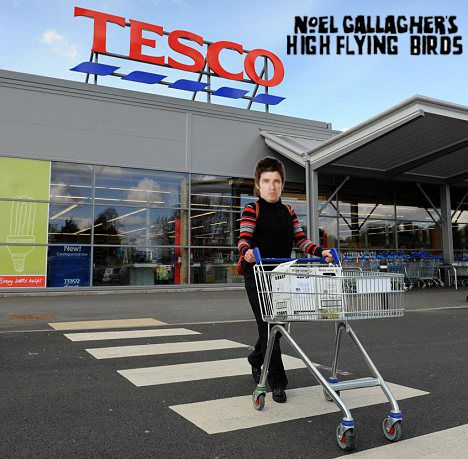
 I found this on the internet. |
|
|
|
Post by stevemeister on Feb 8, 2015 15:06:56 GMT -5
Cover might as well have been Noel pushing a cart out of Tesco.
|
|
|
|
Post by Mean Mrs. Mustard on Feb 8, 2015 15:12:19 GMT -5
Cover might as well have been Noel pushing a cart out of Tesco. At least that would have been a bit relevant  |
|
Deleted
Deleted Member
Posts: 0
|
Post by Deleted on Feb 8, 2015 15:31:41 GMT -5
Cover might as well have been Noel pushing a cart out of Tesco. At least that would have been a bit relevant   It's got a bit of an Abbey Road feel to it. |
|
|
|
Post by Mean Mrs. Mustard on Feb 8, 2015 15:32:41 GMT -5
Did you just stick Noel's face on the body of a middle aged woman?
|
|
Deleted
Deleted Member
Posts: 0
|
Post by Deleted on Feb 8, 2015 15:33:28 GMT -5
Yes I did.
|
|
Deleted
Deleted Member
Posts: 0
|
Post by Deleted on Feb 8, 2015 15:38:28 GMT -5
I've added a logo to it now.
|
|
|
|
Post by Mean Mrs. Mustard on Feb 8, 2015 16:51:08 GMT -5
He sure is rocking that cardigan.
|
|
|
|
Post by LlAM on Feb 8, 2015 17:05:32 GMT -5
He sure is rocking that cardigan. At least he isn't wearing those red trousers! |
|
|
|
Post by stevemeister on Feb 8, 2015 19:02:59 GMT -5
At least that would have been a bit relevant   It's got a bit of an Abbey Road feel to it. Hahahahahahha this is fucking awesome! |
|
|
|
Post by stevemeister on Feb 8, 2015 19:06:01 GMT -5
 It's got a bit of an Abbey Road feel to it. Hahahahahahha this is fucking awesome! All this cover now needs is a Lock on the doors!!!  |
|
|
|
Post by hasseg on Feb 9, 2015 3:10:50 GMT -5
I can't be the only one who actually likes the cover art(s). I really like the CY cover art! |
|