|
|
Post by asimarx on Jul 8, 2021 15:14:43 GMT -5
Apparently, Brian is planning to do more videos on how he created the artwork. I wonder what Michael Spencer-Jones thinks of this. Anyway, this one's slightly nerdy but I'm not ashamed to say that I enjoyed every second of it. Nice to have the confirmation that it's helvetica black italic after all  |
|
|
|
Post by AppleScruff on Jul 8, 2021 15:38:58 GMT -5
Looks like we both created new threads on this about the same time!
Re Michael Spencer Jones - he basically just took the photos as directed by Brian Cannon. Brian and Noel were the brains behind the actual concepts of the sleeves.
|
|
|
|
Post by schorman on Jul 8, 2021 19:00:51 GMT -5
Looks like we both created new threads on this about the same time! Re Michael Spencer Jones - he basically just took the photos as directed by Brian Cannon. Brian and Noel were the brains behind the actual concepts of the sleeves. Well, that's not entirely what Michael Spencer Jones would have you believe. I'm sure the truth is somewhere in the middle. |
|
|
|
Post by yeayeayeah on Jul 10, 2021 17:33:16 GMT -5
Interesting video. I've always wondered why Noel ditched Brian Cannon post 90's. Their 90's artwork is far superior in my opinion.
|
|
|
|
Post by megyesitomate on Jul 10, 2021 18:25:48 GMT -5
And what's his opionon on the fact that the DOYS-era version of the logo is better than the original?
|
|
|
|
Post by thomuk2006 on Jul 11, 2021 10:04:49 GMT -5
|
|
|
|
Post by beentherenow on Jul 11, 2021 10:33:38 GMT -5
Interesting video. I've always wondered why Noel ditched Brian Cannon post 90's. Their 90's artwork is far superior in my opinion. Definitely! Oasis’ 90’s artwork is so iconic, in store they had such a unique visual identity. Heathen Chemistry and Don’t Believe The Truth in particular are woeful efforts |
|
|
|
Post by megyesitomate on Jul 11, 2021 10:52:15 GMT -5
Interesting video. I've always wondered why Noel ditched Brian Cannon post 90's. Their 90's artwork is far superior in my opinion. Superior but that's just because the HC and DBTT eras were that shit. The DOYS artworks, including album and single covers, posters, merchandise, the logo, and even stage visuals, are easily better than anything from the 90s. |
|
|
|
Post by tiger40 on Jul 11, 2021 12:49:17 GMT -5
Interesting video. I've always wondered why Noel ditched Brian Cannon post 90's. Their 90's artwork is far superior in my opinion. Definitely! Oasis’ 90’s artwork is so iconic, in store they had such a unique visual identity. Heathen Chemistry and Don’t Believe The Truth in particular are woeful efforts Yeah, I fully agree with you about Oasis's 90s artwork but from 2000 onwards it wasn't as good although the Dig Out Your Soul artwork is great and the Standing On The Shoulder Of Giants artwork isn't bad. But like you say the artwork for Heathen Chemistry and Don’t Believe The Truth are just awful. |
|
|
|
Post by AppleScruff on Jul 12, 2021 7:40:37 GMT -5
Interesting video. I've always wondered why Noel ditched Brian Cannon post 90's. Their 90's artwork is far superior in my opinion. Superior but that's just because the HC and DBTT eras were that shit. The DOYS artworks, including album and single covers, posters, merchandise, the logo, and even stage visuals, are easily better than anything from the 90s. Really?! I think maybe about 10% of Oasis fans would agree. If you’re lucky. The DOYS cycle did have great artwork though. But nothing beats the 90s sleeve designs. |
|
|
|
Post by AppleScruff on Jul 12, 2021 7:44:04 GMT -5
Interesting video. I've always wondered why Noel ditched Brian Cannon post 90's. Their 90's artwork is far superior in my opinion. Brian talks about this in an interview with Kyle from the Oasis Collectors Group. Brian tweeted the link to this brilliant interview just yesterday I think. Basically it was just the end of the original era after BHN. Everything went very corporate and Noel just wanted a change I guess. Creation was finished and that was a big catalyst. |
|
|
|
Post by megyesitomate on Jul 12, 2021 8:30:32 GMT -5
Superior but that's just because the HC and DBTT eras were that shit. The DOYS artworks, including album and single covers, posters, merchandise, the logo, and even stage visuals, are easily better than anything from the 90s. Really?! I think maybe about 10% of Oasis fans would agree. If you’re lucky. The DOYS cycle did have great artwork though. But nothing beats the 90s sleeve designs. Yeah but that's mostly because of nostalgia I think, which, by the way, isn't a bad thing at all. I had the pleasure of discovering Oasis way after they had broken up so I don't feel nostalgic about them in any way and to me, the DOYS artwork-cycle is easily superior to anything from before.
The 90s album and single covers aren't horribly bad like Lyla's for example (except for maybe Roll With It), but none of them do I find spectacular in any way. Just to name some, the covers of Definitely Maybe or Cigarettes & Alcohol are nice enough and fit the music well but come nowhere close of the 12" edition of Falling Down, which in itself is a piece of art. I like the big booklet that comes with the DOYS boxset so much that I think that might be one of the main reasons why I think DOYS is their best album - and this is something that not even 1% of Oasis fans would agree with me on. It ties together the tracks into an intact album and makes it tell a story as it progresses from song to song and I can't say this about any other Oasis record.
Who Built the Moon managed to recapture this feeling really well, especially because the singles were released as 12"s and I absolutely cannot wait for Noel's next proper album to see what Gareth Halliday will come up with for that. I just wish Liam's management put a bit more effort into the artworks, especially because I really liked the BE era in this regard.
|
|
|
|
Post by AppleScruff on Jul 12, 2021 9:59:12 GMT -5
Really?! I think maybe about 10% of Oasis fans would agree. If you’re lucky. The DOYS cycle did have great artwork though. But nothing beats the 90s sleeve designs. Yeah but that's mostly because of nostalgia I think, which, by the way, isn't a bad thing at all. I had the pleasure of discovering Oasis way after they had broken up so I don't feel nostalgic about them in any way and to me, the DOYS artwork-cycle is easily superior to anything from before.
The 90s album and single covers aren't horribly bad like Lyla's for example (except for maybe Roll With It), but none of them do I find spectacular in any way. Just to name some, the covers of Definitely Maybe or Cigarettes & Alcohol are nice enough and fit the music well but come nowhere close of the 12" edition of Falling Down, which in itself is a piece of art. I like the big booklet that comes with the DOYS boxset so much that I think that might be one of the main reasons why I think DOYS is their best album - and this is something that not even 1% of Oasis fans would agree with me on. It ties together the tracks into an intact album and makes it tell a story as it progresses from song to song and I can't say this about any other Oasis record.
Who Built the Moon managed to recapture this feeling really well, especially because the singles were released as 12"s and I absolutely cannot wait for Noel's next proper album to see what Gareth Halliday will come up with for that. I just wish Liam's management put a bit more effort into the artworks, especially because I really liked the BE era in this regard.
Nostalgia plays some part but the Microdot sleeves mainly did a great job of linking to the song, or the feeling/meaning behind them. They also captured the band well and established the iconic logo. And they look fantastic as stand alone pieces of art in my opinion. I like Falling Down for example but whilst it’s nice artwork, it doesn’t really tie into the song in any way. I agree re Gareth Halliday though, his work is superb. A view shared by Brian Cannon incidentally. |
|
|
|
Post by welshylad on Jul 12, 2021 10:04:22 GMT -5
How anyone can sit there for 20 minutes and listen to someone talk about a logo (and a shit one at that! ) baffles me |
|
|
|
Post by tiger40 on Jul 12, 2021 12:36:15 GMT -5
How anyone can sit there for 20 minutes and listen to someone talk about a logo (and a shit one at that! ) baffles me Well, I wouldn't listen to anything like that either. |
|
|
|
Post by tiger40 on Jul 12, 2021 12:38:01 GMT -5
I've always loved the Roll With It artwork for example and even though the Wonderwall artwork isn't one of my favourites it's very iconic.
|
|
|
|
Post by yeayeayeah on Jul 13, 2021 5:10:25 GMT -5
Interesting video. I've always wondered why Noel ditched Brian Cannon post 90's. Their 90's artwork is far superior in my opinion. Superior but that's just because the HC and DBTT eras were that shit. The DOYS artworks, including album and single covers, posters, merchandise, the logo, and even stage visuals, are easily better than anything from the 90s. I disagree. The DOYS artwork is the best of the 00s but it's not as unique as the Microdot work. What I like about the 90s artwork is it is all in a similar style. The 00s could be from 4 different bands. I also far prefer the original logo, DOYS was an improvement again but for me it isn't quite as striking. |
|
Wolf
Oasis Roadie
 YOU DON'T LIKE BEETHOVEN
Posts: 420
|
Post by Wolf on Jul 13, 2021 11:57:14 GMT -5
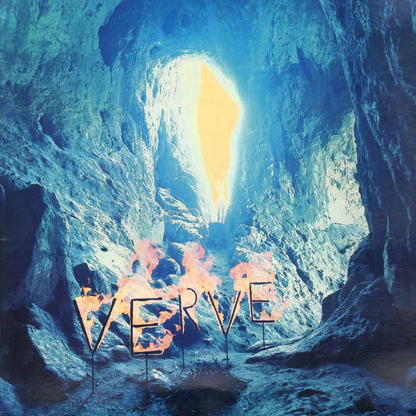
Couple of people here shitting on Brian's video for no reason. The man is a great graphic designer / artworker. Even if you think the Oasis logo is shit, the covers he produced were great. Even better were his early Verve sleeves, really great stuff.  |
|
|
|
Post by The Crimson Rambler on Jul 13, 2021 15:02:42 GMT -5
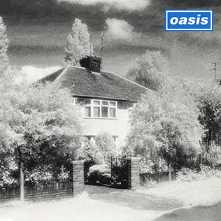
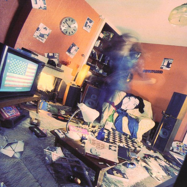
This has come at the perfect time for me as I started studying graphic design this year. Here are my top 3 favourite Brian Cannon sleeves in no particular order:  |
|
|
|
Post by asimarx on Jul 13, 2021 15:20:53 GMT -5
This has come at the perfect time for me as I started studying graphic design this year. Here are my top 3 favourite Brian Cannon sleeves in no particular order: Absolutely adore the artwork he did for (The) Verve. The suede designs are great too. Never knew he worked for the Inspirals as well, so thanks for posting. I have no graphic design knowledge whatsoever but I like the fact he created them all by analog means. |
|
|
|
Post by The Crimson Rambler on Jul 13, 2021 15:34:39 GMT -5
This has come at the perfect time for me as I started studying graphic design this year. Here are my top 3 favourite Brian Cannon sleeves in no particular order: Absolutely adore the artwork he did for (The) Verve. The suede designs are great too. Never knew he worked for the Inspirals as well, so thanks for posting. I have no graphic design knowledge whatsoever but I like the fact he created them all by analog means. Yeah that early Verve stuff is great. Just had a quick Google to double check the 'Revenge of the Goldfish' and Brian is acknowledged as having designed the 'sleeve layout' whilst the photo is actually by Sandy Skoglund which makes sense. Guess that doesn't really count then! Ok here's my replacement: 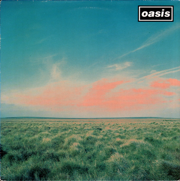 Yeah there's definitely something about analogue which digital just doesn't capture. |
|
Deleted
Deleted Member
Posts: 0
|
Post by Deleted on Jul 13, 2021 15:58:31 GMT -5
How anyone can sit there for 20 minutes and listen to someone talk about a logo (and a shit one at that! ) baffles me I'm a designer and could listen to someone talk about these things a lot longer than 20 minutes. I guess the world of design isn't as interesting to everyone, and that baffles me  |
|
|
|
Post by Jessica on Jul 13, 2021 19:47:24 GMT -5
Eh, it's very little to do with it being analog. It's in the way he staged the shots/made creative choices specifically for the format, which stood out in the 90's and stands out now even with the square format having been the norm for almost decade now.
|
|
|
|
Post by mossy on Aug 5, 2021 17:11:11 GMT -5
Absolutely adore the artwork he did for (The) Verve. The suede designs are great too. Never knew he worked for the Inspirals as well, so thanks for posting. I have no graphic design knowledge whatsoever but I like the fact he created them all by analog means. Yeah that early Verve stuff is great. Just had a quick Google to double check the 'Revenge of the Goldfish' and Brian is acknowledged as having designed the 'sleeve layout' whilst the photo is actually by Sandy Skoglund which makes sense. Guess that doesn't really count then! Ok here's my replacement: Yeah there's definitely something about analogue which digital just doesn't capture. It was Noel who got Brian that Inspiral Carpets gig. www.nme.com/photos/brian-cannon-s-stunning-album-artwork-in-his-own-words-1417308X |
|
|
|
Post by tiger40 on Aug 6, 2021 12:30:16 GMT -5
The Whatever artwork is ok but it's not one of the best in my opinion.
|
|