|
|
Post by peardrop on Jan 14, 2014 15:17:11 GMT -5
Just wondered what it would look like:  |
|
|
|
Post by peardrop on Jan 14, 2014 15:21:01 GMT -5
Answer: crap.
|
|
|
|
Post by liamsloafers on Jan 14, 2014 15:21:44 GMT -5
Answer better
|
|
|
|
Post by Lennon2217 on Jan 14, 2014 15:44:05 GMT -5
Just wondered what it would look like:  In my opinion, Oasis should have never gotten away from their classic logo. That was a mistake. |
|
Deleted
Deleted Member
Posts: 0
|
Post by Deleted on Jan 14, 2014 17:19:13 GMT -5
Just wondered what it would look like:  In my opinion, Oasis should have never gotten away from their classic logo. That was a mistake. I agree, variations of the logo are alright (I.E Don't Believe The Truth or DOYS to an extent) but the SOTSOG and Heathen Chemistry logo just looks nasty. It takes away from the feel of the band d'you know what I mean? |
|
|
|
Post by Headmaster on Jan 14, 2014 17:46:45 GMT -5
The logo would be better above the word "Standing".
|
|
|
|
Post by mkoasis on Jan 14, 2014 21:29:41 GMT -5
I don't mind the SOTSOG logo, and I can understand why the band went with that option at the time. But the HC one wasn't great. The DBTT and DOYS logo were nice variations on the classic.
|
|
|
|
Post by rupertg on Jan 14, 2014 21:49:18 GMT -5
The original logo will always remind me of the Bonehead/Guigsy era Oasis.
So it's very fitting that they kept changing it.
|
|
|
|
Post by Binary Sunset on Jan 14, 2014 23:38:57 GMT -5
I think it looks better. Although I didn't mind the album cover for SOTSOG. However, the HC one made it look awful...
|
|
|
|
Post by freddy838 on Jan 15, 2014 3:20:52 GMT -5
Nah I prefer the newer logo. Great artwork, great sound, could've been a great album with a couple of changes.
|
|
MicknSiv
Madferrit Fan
  Noodles!
Posts: 90 
|
Post by MicknSiv on Jan 15, 2014 5:58:08 GMT -5
Just wondered what it would look like:  In my opinion, Oasis should have never gotten away from their classic logo. That was a mistake. Agreed. |
|
|
|
Post by peardrop on Jan 15, 2014 13:36:23 GMT -5
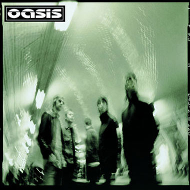
and Heathen Chemistry:  |
|
|
|
Post by Binary Sunset on Jan 15, 2014 15:00:43 GMT -5
and Heathen Chemistry:  That definitely looks better. Although the cover still is awful. I wish they had used some of the single covers for the album... |
|
|
|
Post by allingoodtime on Jan 15, 2014 15:39:37 GMT -5
Theres something I love about SOTSOG..
|
|
|
|
Post by peardrop on Jan 15, 2014 16:38:56 GMT -5
That definitely looks better. Although the cover still is awful. I wish they had used some of the single covers for the album... Yeah. I can't think of any of the songs off that album without associating them with that horrible washed out grey colour. I'd genuinely like the album more if I liked the album cover. It's just staggeringly bad, I don't know how these things happen. |
|
Deleted
Deleted Member
Posts: 0
|
Post by Deleted on Jan 15, 2014 16:54:37 GMT -5
Lol, we need a new Gallagher album soon to anticipate before we all start debating what our favourite Andy Bell haircut is!
|
|
Deleted
Deleted Member
Posts: 0
|
Post by Deleted on Jan 15, 2014 17:42:46 GMT -5
and Heathen Chemistry:  Now that takes some getting used to. What a fucking pessimistic album cover! |
|
|
|
Post by peardrop on Jan 15, 2014 21:26:51 GMT -5
Just made a new one:  |
|
|
|
Post by mkoasis on Jan 15, 2014 22:01:34 GMT -5
and Heathen Chemistry:  I know its not a popular position but I love the HC artwork. The SCYHO single cover was great but the others were just ok. Besides, its not dull grey, its got a lovely greenish tint to it  |
|
|
|
Post by mkoasis on Jan 15, 2014 22:02:55 GMT -5
Just made a new one:  This one could be a perfect Travis album cover. Nice. |
|
|
|
Post by Headmaster on Jan 15, 2014 23:12:56 GMT -5
Besides, its not dull grey, its got a lovely greenish tint to it  Are you talking about this, innit?  Much better with this greenish tint, it gives more life to the cover, the original one looks very monochromatic, also I don't like the DBTT cover, it needs another colour too. |
|
|
|
Post by Lennon2217 on Jan 15, 2014 23:30:07 GMT -5
Just made a new one:  This one could be a perfect Travis album cover. Nice. Yeah..........total Travis vibe.  |
|
|
|
Post by Lennon2217 on Jan 15, 2014 23:31:00 GMT -5
Besides, its not dull grey, its got a lovely greenish tint to it  Are you talking about this, innit?  Much better with this greenish tint, it gives more life to the cover, the original one looks very monochromatic, also I don't like the DBTT cover, it needs another colour too. The Heathen Chemistry album cover always seemed boring and lazy to me. This is a band that once had GREAT album/singles artwork. |
|
|
|
Post by themanwithnoname on Jan 16, 2014 5:27:27 GMT -5
That SOTSOG cover looks much better with the original logo - nothing can save the Heathen Chemistry artwork. Just appalling. And what was that 'both singing into the same microphone' shit all about?  |
|
|
|
Post by peardrop on Jan 16, 2014 11:41:52 GMT -5
|
|

